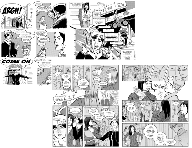
My brother recently sent me a copy of his novel through his Kindle account. He’s been writing it in his spare time while teaching in South Korea. He wants me to send him a copy of what I have finished of Sacco. But I’m hesitate. Not because I don’t want his opinion. It’s because the drawings from the first chapter are inferior to my latest completed pages. Plus I’d like to believe my storytelling has gotten better.
I mentioned this hesitation to him. He said it’s not uncommon- look at the Harry Potter books. J. K. Rowling’s craft in the first book feels rough and jagged compared to the final. He had a point. Except novels are typed words. Their worth is contingent on if you know the language it’s printed in. A graphic novel is apparent no matter what language- at least visually.
Below are the first 2 pages I created in January 2009 overlapped by the 2 pages I completed inking this week (P172-173). I haven’t finished adding all the grey tones to the pages from this week. As for the 2009 pages, at that time I had just begun inking with a brush and constructing entire pages with several panels. Prior to this I normally did one-off illustrations with ink pens for freelance assignments. The 2009 pages aren’t in my final draft of Sacco. I’ve already redrawn them.
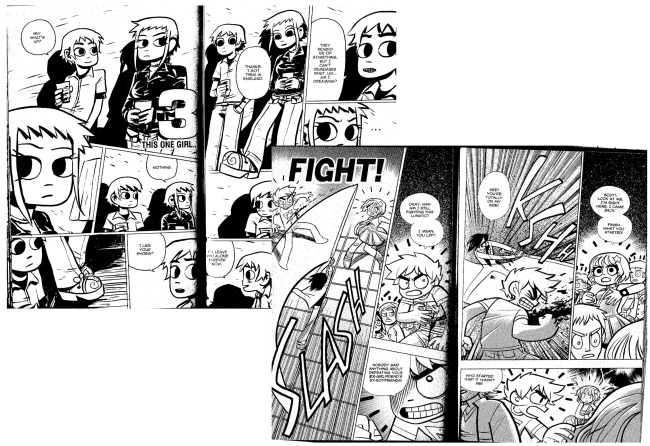
However I’m not the only illustrator/cartoonist whose style changes as their work progresses. Look at Bryan Lee O’Malley’s work from the first and sixth Scott Pilgrim book (below). There is a vast difference. Tighter lines, better form, more apparent panel edges and all his characters don’t look alike by the end of the story. (The last one is a common complaint I’ve heard by fans of the series)
So maybe it doesn’t matter what the earlier pages look like.


